Redesign for the National Association of the Remodeling Industry
My Role: Customer Insights & User Research, Planning & Scope Definition; Information Architecture; Wireflows & Wireframes; High-Fidelity Prototypes: Desktop & Mobile; Handoff
All about homes
The National Association of the Remodeling Industry is the top national source of information for homeowners looking to build or renovate. Their website was outdated, difficult to navigate, and unappealing to their higher-end clientele. We build a new and expanded website to accommodate new features for clients nationwide while also elevating their brand experience with a modern user interface. I led the Product Design-User Experience (UX) and User Interface (UI) stages of this project. I also received constant feedback from engineers, copywriters, and stakeholders to ensure my design would accommodate different needs.
Client: National Association of the Remodeling Industry (NARI)
Team:1 Designer, 1 Copywriter, 1 Proj Manager, 3 Engineers

The problem:
NARI is the top association for home remodeling in the USA, with active chapters in almost every state and thousands of registered volunteers, professionals & members. Their online portal, however, was outdated, confusing, and mostly inconsistent.
The task involved designing a complete new website with several new pages of useful resources, while intuitively accommodating their complex content. We started with the redesign of their Milwaukee chapter.

Research:

The portal was content-heavy. Pictured here is the old Information Architecture map, where every rectangle represents a different page.
So, I proactively conducted research with the target audience—middle to upper-class homeowners aged 50 and older—to determine how they would naturally categorize the various sections and pages on a screen. The goal was to understand what would be intuitive for them.

With this activity, I gathered data from twenty individuals of varying ages and races.
The image illustrates a user's response. The blue cards represent the main navigation, while the green cards denote potential pages or sections. On the left side of the image, are the green cards that the user could not categorize.
On the right side, the user indicates their suggestions for the best possible groupings for the main sub-pages.

Users were also able to leave comments on specific page names that they were confused about. For example, this image shows some users couldn't make the correlation between the page name “Inspo” and its desired content (an inspirational gallery of photos). Therefore, the name of the page was changed to Inspiration Gallery, making it clear to users of all ages.
The purple, blue, and dark green cards correspond to the pages and sections that most users associate with the same main navigation categories. This indicates users expected to find information about these topics nested under the same main page. In contrast, the red cards represent the categories that were least placed by users, suggesting that we needed to reconsider their naming and positioning in the navigation. Users found it unclear where to go to find information related to these topics.
This exercise allowed us to propose to our clients that we revise certain naming conventions and restructure the main navigation system.
Final Result:


Home Page, Desktop

On the home page, we created an area with quick links to the most important content to aid navigation, right below the hero banner.
We separated the content into two categories: Homeowners and Professionals. Each one contains specific content created and organized specifically to their needs. We highlighted this section near the top of the page, creating quick links to the most popular parts of the platform.
New Feature: Quick Links

New Feature:
Preview of Next Events
We created a dedicated area for users to see what's next in the calendar of events. Here they can check what's coming, as well as the three next events, with links to details and tickets.

Inspiration Gallery
For the new inspiration page, users can now search for home renovations based on room type, cost, awards won, and year completed. This detailed search feature allows both professionals and homeowners to explore all available options tailored to their specific needs and budgets.

Inspiration Gallery
Upon selecting a search result, users get access to a gallery of high-quality photos, details about the company responsible for the home renovation, and links to find a NARI-certified contractor for their next renovation.

Featured Articles
NARI's article page was also content-heavy, and constantly growing. To help users find what they need more easily, articles were then tagged as “for homeowners” or “for professionals”. Users can now see the title, preview, date, and category of the article before clicking a link, speeding up the search process.


Content-heavy Areas
For extremely content-heavy pages, we found elegant solutions for improving titles and descriptions, and breaking up sections with imagery and graphics, all to make such pages easier to navigate.
Similarly, their footer had the mission to contain quick links to all the main navigation items. We utilized broad white space between elements to keep it organized.
Lastly, a new CTA to their newsletter now allows users to select the kind of information they'd be interested in receiving. As a result, NARI has been able to maintain more subscribers, who now only receive relevant info.


Mobile Navigation
To improve the mobile experience for users, NARI required an effective way to streamline its extensive navigation system. We reorganized their menu, incorporating color contrast, icons, and other design elements to clearly distinguish the various sub-areas under the main navigation.
The mobile menu also features a search bar and a call-to-action (CTA) button, allowing users to quickly find a contractor.

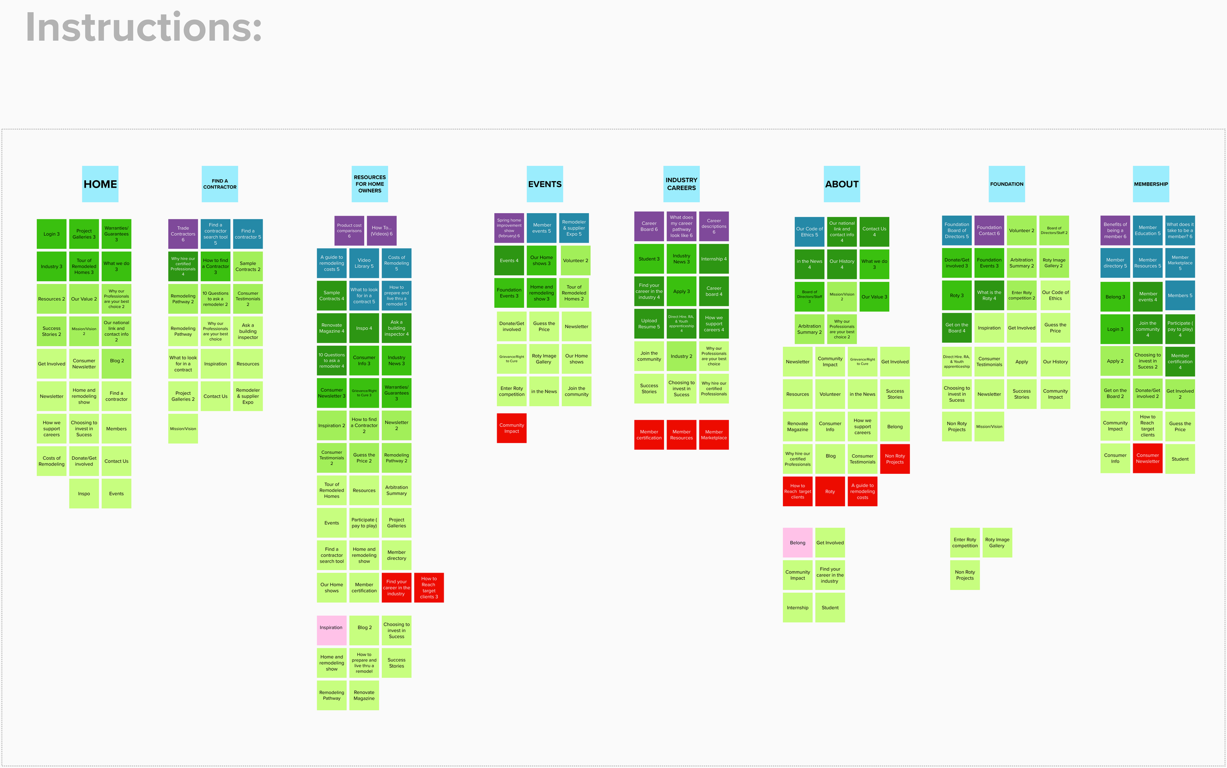
Process shot of the new Information Architecture map. We optimized and reorganized all the content (including copy within the pages) based on our research findings, making navigation quicker and clearer. I worked on prototyping all the pages in this map.

Top-to-bottom view of some of the many pages designed.