Yummy - Packaging & Brand Identity
Label, Packaging, Brand Identity, Typography & Illustration
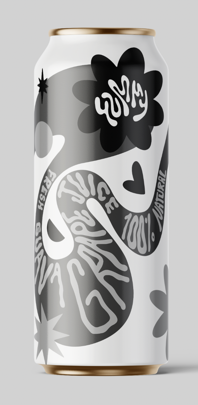
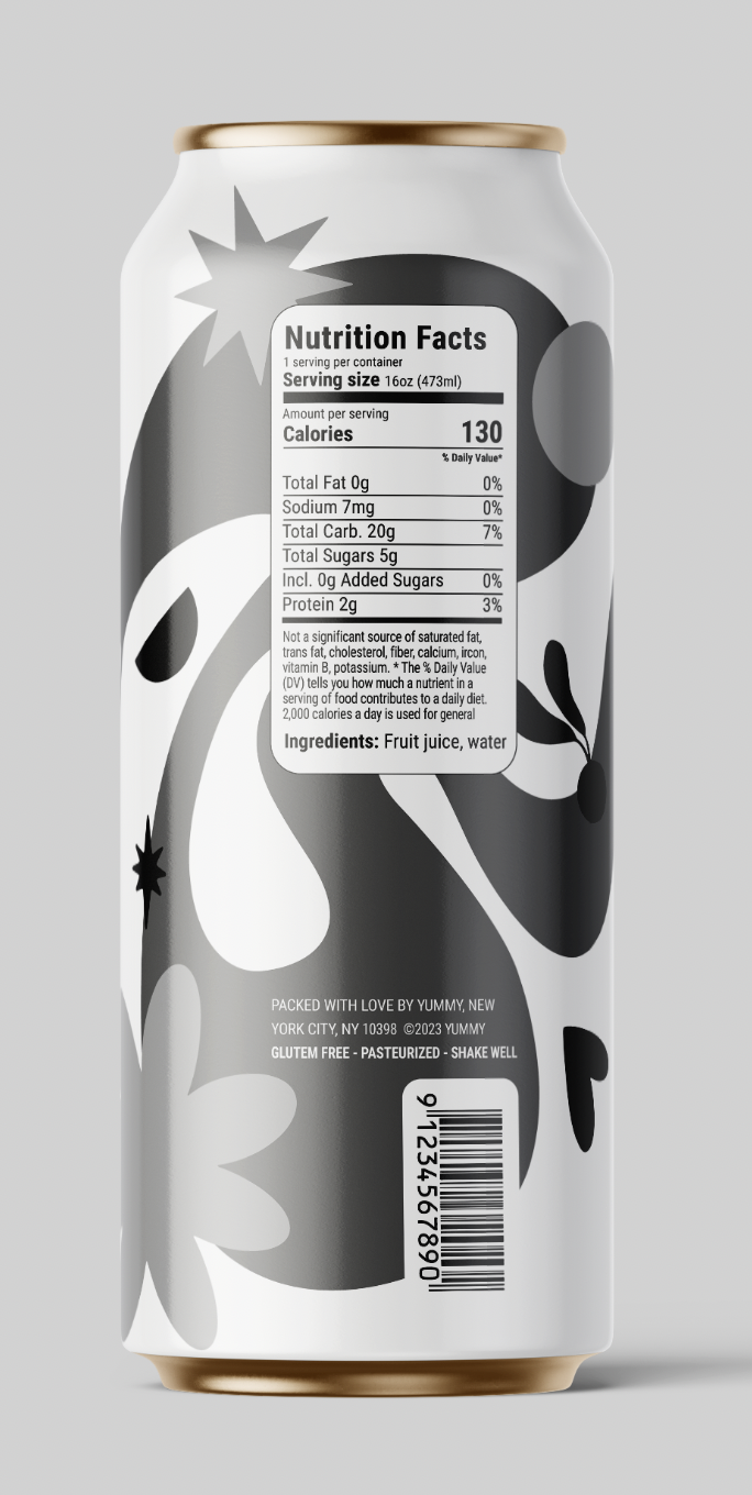
Yummy is a fun & bold brand of natural juice drinks that brings fun pairings of fruits made from real ingredients. No artificial colors, added sugars, or chemicals. Just fruit, water, and fun! I illustrated Yummy's four debut flavors: Orange Mango, Apple Peach, Guava Grape, and Kiwi Berry.
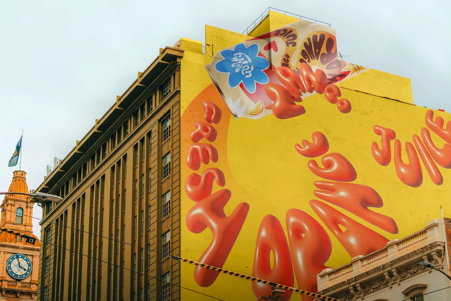
Yummy's unique visual brand identity is playful and daring. The typography used for all labels and marketing materials is hand-drawn, with organic shapes and round corners, adaptable to different spaces. These characteristics give it a youthful personality, with the target audience being environmentally conscious older teens and young adults. This joyful and approachable style also makes the design stand out from the competition.
Illustrator & Designer: Mickt Flior | @artsymickt




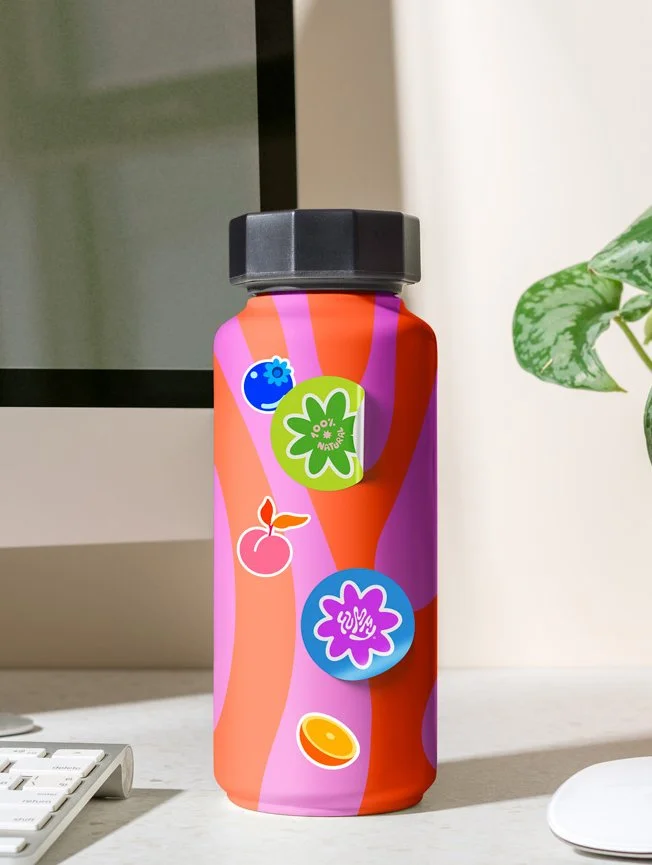


Ideation Process
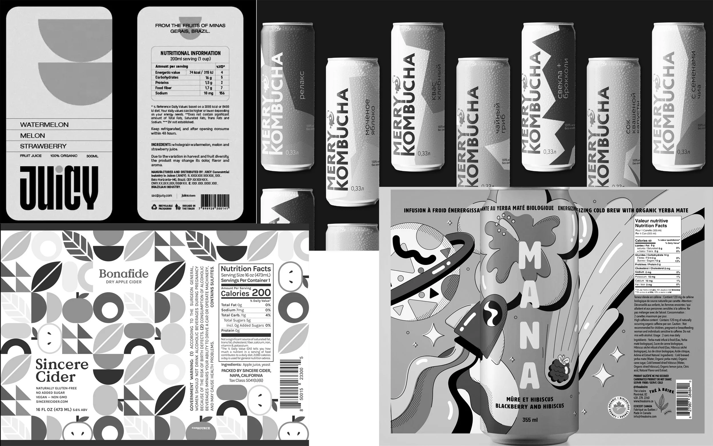
I created several different moodboards for this project. The first one was the label moodboard.
I studied graphic compositions that were modern, fun & bold. To not be influenced by any other existing color combinations, I removed color from my reference moodboards to focus on the compositions.
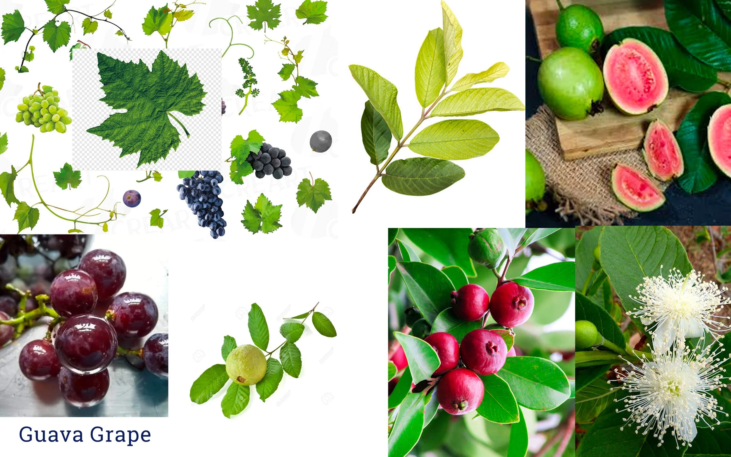
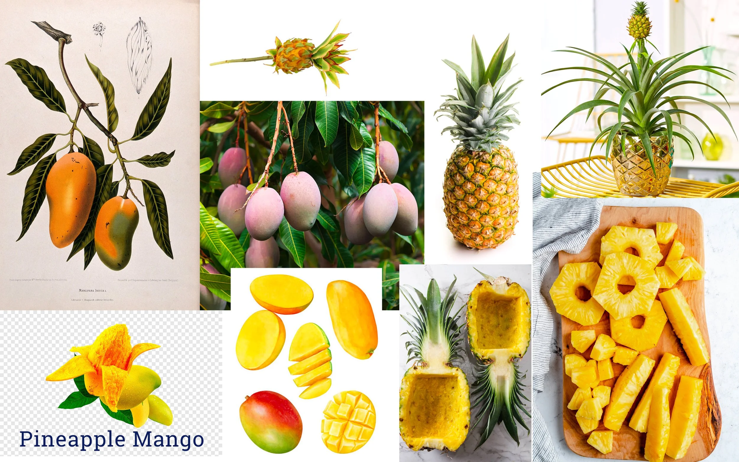
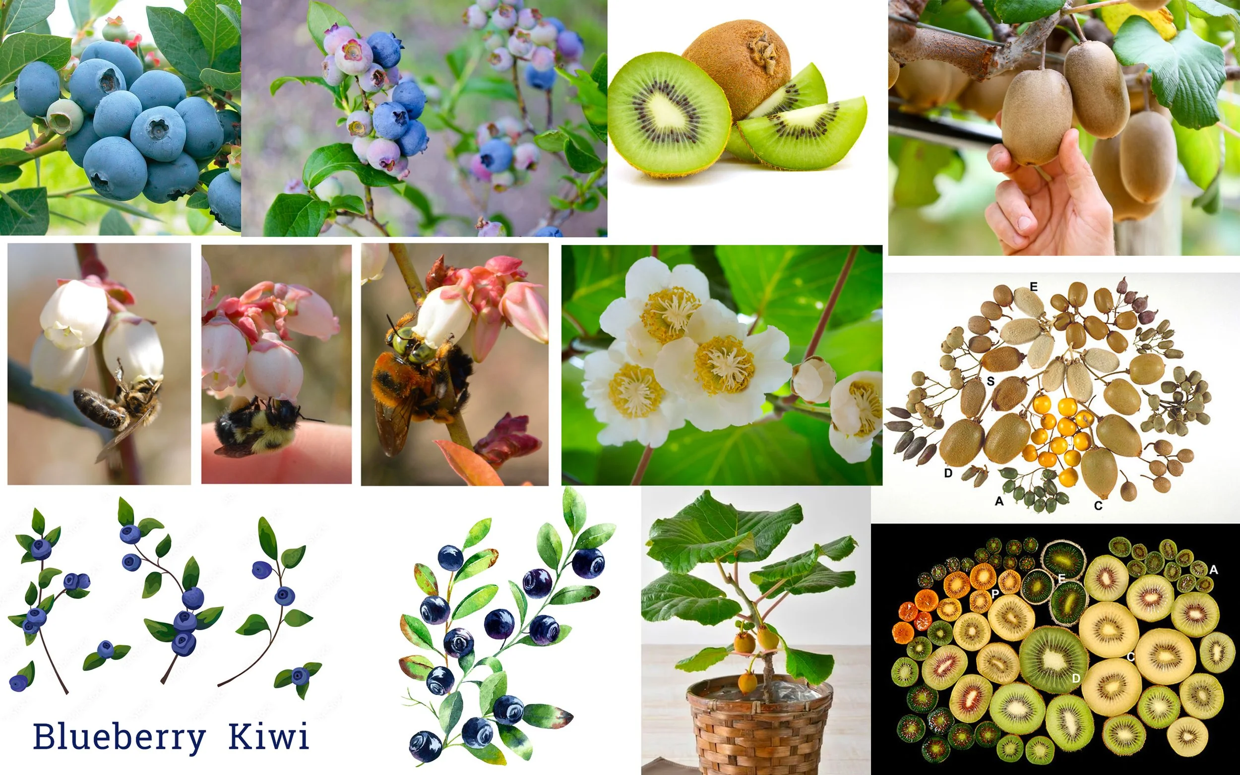
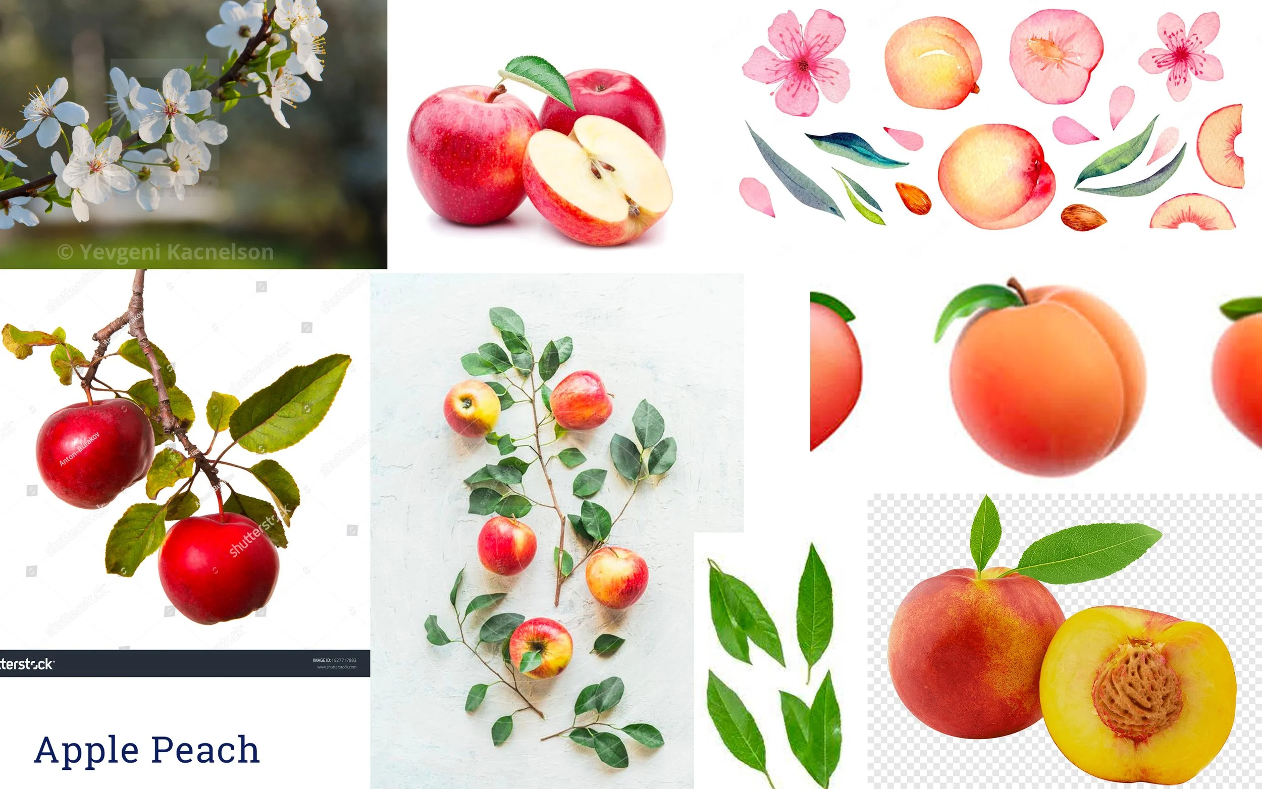
I also conducted industry research to study what flavor combos are most popular with audiences in the USA. Later, I collected reference images for each flavor mix, gathering different angles and stages of the same fruits to illustrate a cohesive collection.
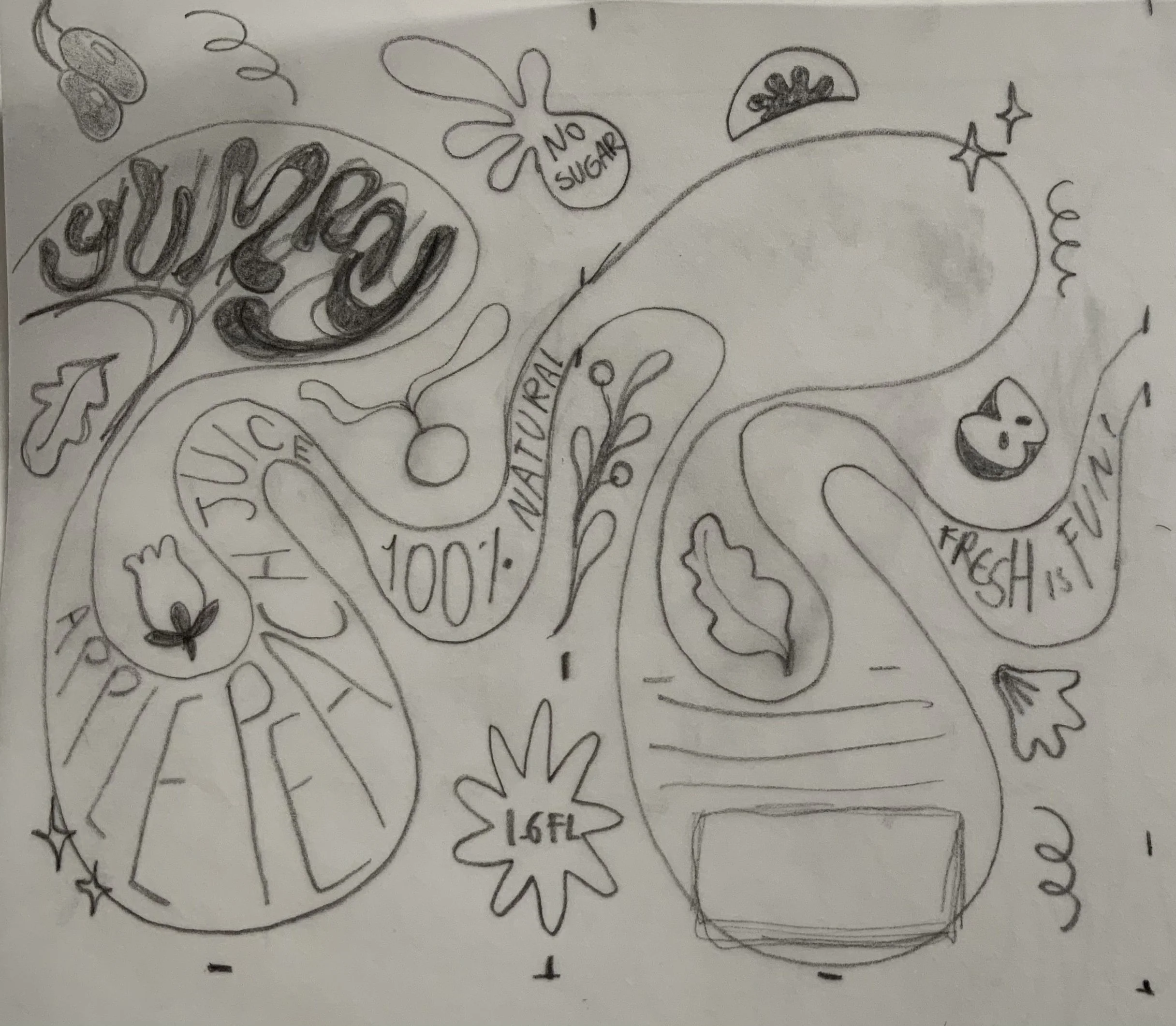
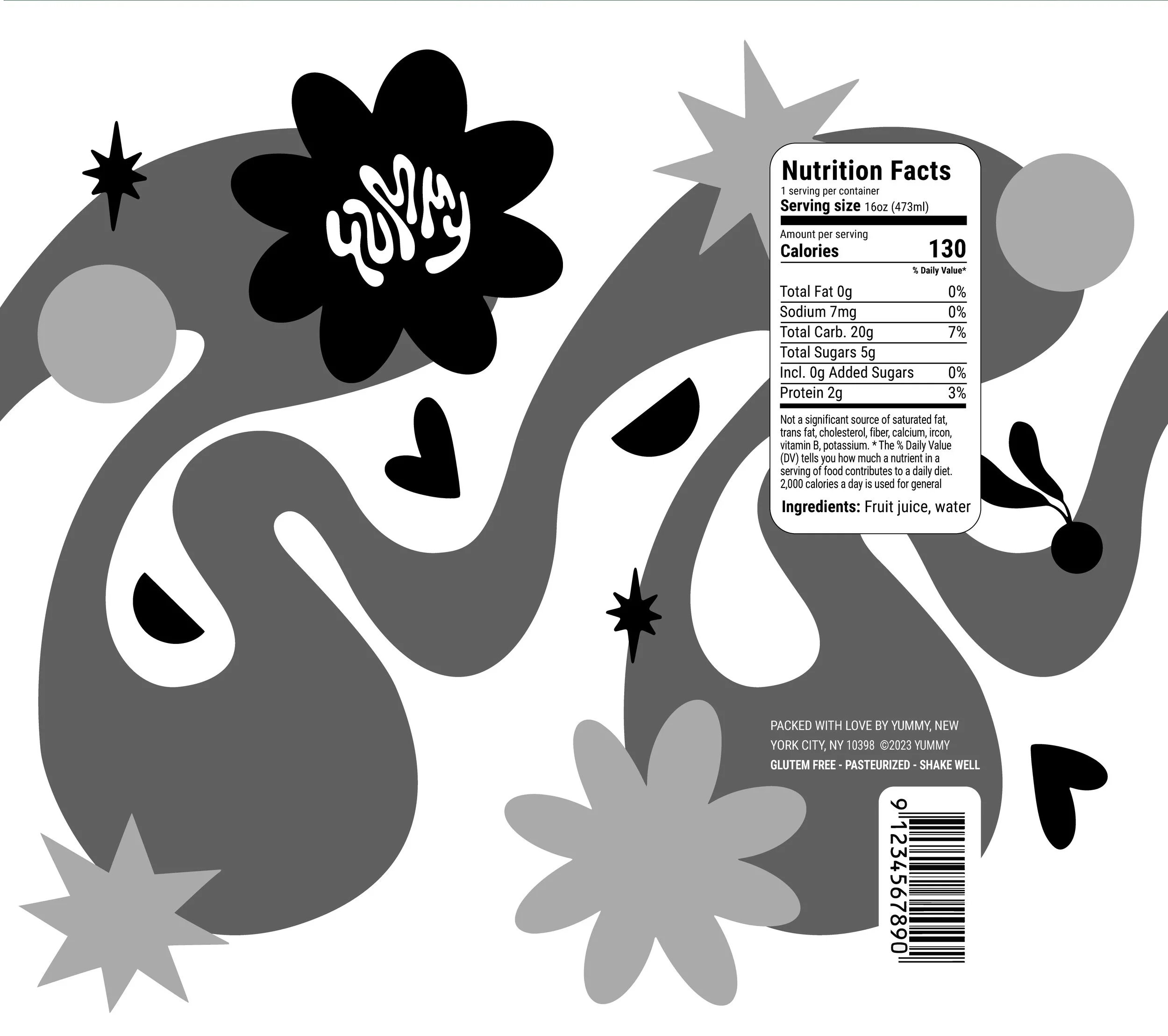
To create a seamless shape that wraps around the can, I hand-drew the label on paper, using real dimensions. Later, I was able to create a seamless pattern shape (below) that would serve as a canvas for my illustrated lettering.
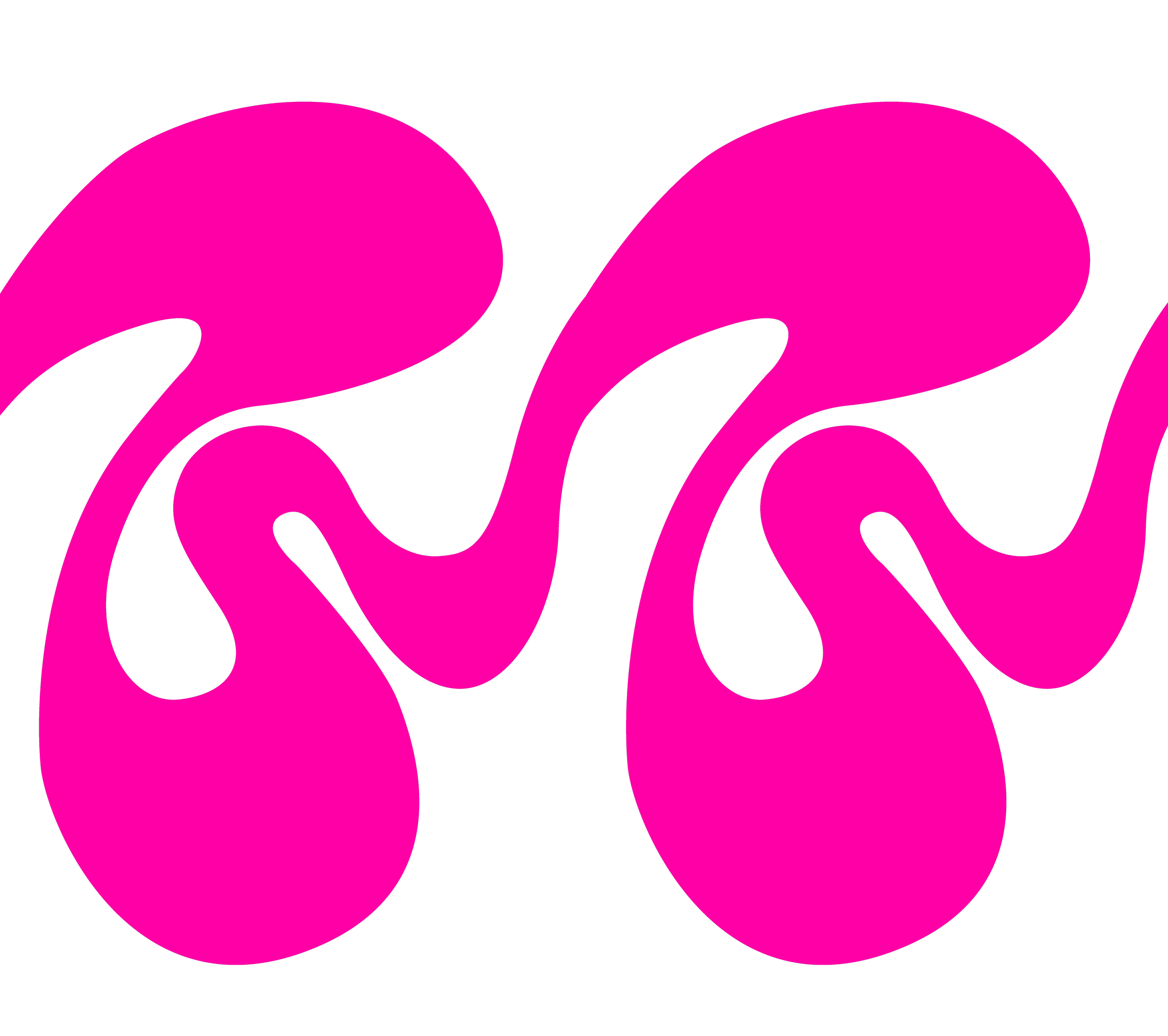
Lastly, I vectorized the base shapes & did several rounds of tests with mockups to evaluate legibility and contrast. I applied all lettering for the four labels by hand - drawing with an iPad.